As the year comes to an end, we find ourselves thinking about all of the good (and bad and ugly) design this past year and previous years have brought us. We are constantly tuned in to and aware of the trends that come and go. And while reflection is important, looking towards the future is something on which we prefer to focus. To make sure everyone stays trendy and relevant as they ring in the new year, we thought it would be nice to inform you of the current and future trends we think will last!
Without further ado, here are the top five trends to keep on your radar for 2017:
1. Bespoke Illustration
A trend that continues to grow, bespoke illustration styles in design are becoming ever more popular across a wide variety of mediums advertising, packaging, branding and more. As artists and designers, we have always appreciated the unique handmade and contemporary styles seen from illustrators popping up all over the world. We've seen it and loved it, and it has been making its way into the hearts of others across the globe. Perhaps a way for big businesses to relate more closely to their consumers, these illustrations such as those seen in work produced by Mark Conlan and Ana Jaks are by far some fan favorites here at NeigerDesign.

Image by Mark Conlan

Image by Ana Jaks
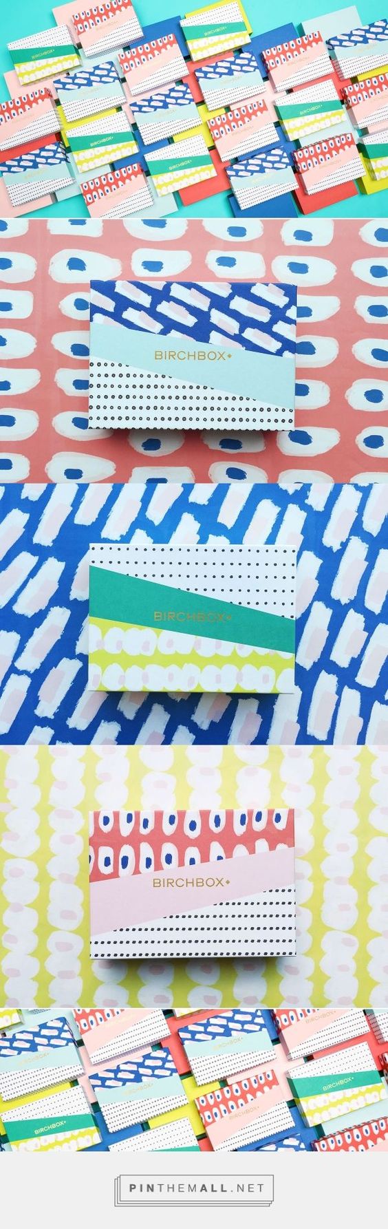
2. Patterns and Texture
Fitting right into our obsession with handcrafted styles, the prevalence of printed abstract patterns as a textural element in graphic design has become increasingly popular over the past year. We don't expect to see these styles going away anytime soon. Some great examples of this trend style include packaging created for Birchbox and Mast Chocolate who never fail to disappoint us visually. Their products sure are enticing!

Image from Birchbox, design by Design Packaging, Inc.

Image by Mast Brothers
3. Bold Serif Fonts
Making their appearances increasingly on the web, bold serif fonts are making a comeback in opposition to the ever-so-popular sans serif trend we've seen over the past couple of years. Whoever said serifs only belong in print was wrong. These playful typefaces make websites and marketing collateral feel more approachable and friendly great for attracting customers and clients.

Image by Pablo Alfieri

Image from Purple, Rock, Scissors

Image from Warby Parker
4. Sophisticated Flat
The flat illustration trend was so 2016 and so unsophisticated (just kidding about the second part). Similar to the flat style, sophisticated flat uses a larger minimal color palette and is enhanced by a sense of dimensionality that its counterpart lacks. This is sometimes achieved by variations of tone, highlights and shadows. The addition makes icons and illustrations more robust, and yes, sophisticated. If you want to learn more about the origins and benefits of using flat design this article by Tubik Studio does a great job.

Image by PJ Offner
![]()
Image by Eriks Cernevskis
5. GIFs
While GIFs have been around for a few decades, they are popping up more and more in corporate email campaigns, advertising and social media posts. Quite often you'll see them in the flat illustration style mentioned above and as seen below by Illustrator Eran Mendel. Additionally, companies such as Brit + Co and Plated are utilizing stop motion GIFs to create short DIY tutorials (skipping the boring parts). These interactive snippets of joy are more engaging to our increasingly small attention spans and convey emotion better than many static images can.

GIF by Eran Mendel

GIF by Brit+Co

GIF by Plated
Comments
Questions or comments? Join the conversation!