Well summer is officially here as of June 20th. The summer solstice rang in the season with a gorgeous full moon and a hot muggy day. Now we can look forward to long warm nights spent with family and friends, barbecuing on the grill, trips to the beach, and of course design trends. Yes, design trends. Here at NeigerDesign we're always going back to thinking about how we can use our creativity and adapt to our surroundings. So as the new season rises, I thought I would put together a list of graphic design trends that we should all keep in mind during the summer in order to keep creating fresh and innovative content.
So here it is, my list of 5 graphic design trends you should be aware of this summer.
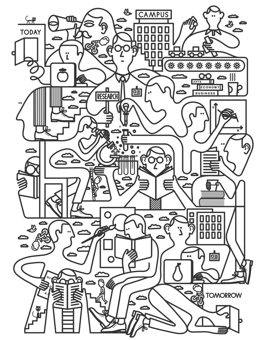
1. Expressive or stylized monoweight line illustration
Minimalism is a trend that has been pervasive in the graphic design world for a while now and is still going strong. An aspect of minimalism is using simple images. One way of doing this that has been gaining in popularity is by using thin monoweight line drawings. This is a way to make consistent imagery throughout your design or brand that has a simple yet bold look. It can be used expressively to create a pattern or design, or it can be used in more detail to create a stylized drawing of anything from a city skyline to a person to an ice cream cone. Using this style is a good way to incorporate text and design in a cohesive way by pairing with hand-created letters using the same monoweight style. This trend is also heavily used to create icons or symbols which have become an incredibly popular way to represent simple navigations on a website, among other things. Here are some major elements to keep in mind:
-
Bold colors
-
Consistent thin lines
-
Personalized type or type with same line weight
-
Stylized cartoonish quality
Jonathan Calugi

Quillo Creative

TJ Cichecki

Drew Ellis
2. Material design
One of the most popular web design trends of 2016 is material design. Since Google launched this "visual language" to consolidate all of their design last year, the style has been adapted by countless companies and designers. What started as a web design trend has now been adapted by graphic designers and artists alike. It is a style that plays on the common flat style of graphic design and adds aspects of motion and depth to add interest and realism to beautifully designed minimalist images. There is often more drop shadows and added aspects of realism as well as bright bold colors. Google describes the need for "deliberate color choices, edge-to-edge imagery, large-scale typography, and intentional white space." Here are some major elements of material design:
-
Flat icons with added realism
-
Drop shadows and depth
-
Bright consistent colors
-
Flat sans serif type


Gmail

Fireart Studios

Moritz Adam Schmitt
3. Neo-Memphis design
Neo-Memphis design is a new trend that is currently evolving in the graphic design world. Although it appears to be a very modern design style, it actually originated in the 1980s by an Italian group of interior designers called the Memphis Group. They were led by Ettore Sottsass and were known for their pop art style as well as their use of crazy geometric shapes, plastic materials and bright neon colors in their furniture and designs. This striking design style is making a comeback in interior design, fashion, and graphic design. Whether it be for print, for the web, or for packaging, Neo-Memphis design is definitely something all graphic designers should take note of. And with it's eye catching graphics and bold colors, it's hard not to take note. Here are a few of the elements that typify the Neo-Memphis style:
-
Flat, vector style design
-
Black and white geometric or organic patterns juxtaposed with bright pastels or bold blocks of color
-
Zig zags, squiggles, and other erratic images throughout the design
-
Graphic sans serif fonts

Write Sketch &

A-2-O Studio

Muokkaa Studio

Peter Borg
4. Modern Retro style
Not unlike Neo-Memphis, this trend also borrows from design styles of the past. The popular modern retro style uses aspects of vintage images anywhere from the 20s to the 60s. This broad style borrows from many areas such as old-fashioned packaging, travel posters, stamps, and signs but puts a modern twist on it. Graphic designers are cleaning up and updating the descriptive and decorative labels and adding modern line border work and simple images to create a great blend of modern and retro styles. This trend is great for product package design as well as logos and posters. Here are some major elements of this retro style:
-
Intricate but clean typography often with variations of script and sans serif fonts
-
Muted, rustic color palettes
-
Distressed textures
-
Badge style logos

Fuel Coffee

US Travel Bureau

John John

Hathor
5. Bold photography and sleek text
A trend I have been seeing a lot of recently is the use of a bright and bold photograph juxtaposed with simple black and white text and backgrounds. It is sometimes a colorful photograph of a texture or pattern, like palm leaves, with a white box with black text within it or a sharp photograph with a white border around it and minimal black text. The photo is sometimes blurred and other times very crisp. Alternatively, there is a realistic painting of something like flowers with the text interacting with it or put on top of it. It is usually a minimal style with the text and vector images being very simple with only a few colors and the background image being bright, clear and bold. This creates an interesting contrast and a really modern and sleek look. Keep these things in mind when creating something in this style:
-
Stacked text
-
Black and white text or use of one bright color to display text and borders
-
Sharp lines
-
Sans serif font or handwritten calligraphic type
-
Beautiful photography or realistic painting

Fabian De Lange

My Dear Paper

Caterina Bianchini

The Gentlewoman
These are 5 trends you should be aware of for summer 2016 and beyond. Have you used any of these in your work? Did we miss any big trends? Let us know on Twitter or comment below!
Want to see more graphic design trends explored? See designer Jessica's "Trend Rapport" SlideShare that reports on trends in design and includes a message for designers to establish rapport and explore design together.
Comments
Questions or comments? Join the conversation!